Tips and Tricks for Creating Informative and Engaging Infographics

Tips and Tricks for Creating Informative and Engaging Infographics

Creating Informative and Engaging Infographics — Infographics are a highly effective visual tool for conveying complex information in a simple and engaging manner. By combining text, images, and graphics, infographics can make data more understandable and memorable.

Why are Infographics Important?

  • Facilitates Understanding: Infographics present information in a visual format that is easier to digest than plain text.
  • Increases Engagement: Attractive and interactive designs make infographics more appealing to view and share.
  • Improves Information Retention: Visually presented information tends to be remembered more easily.
  • Strengthens Branding: Consistent infographics with a brand’s visual style can reinforce brand identity.

Tips for Creating Effective Infographics

  1. Define Your Goal:
    • What do you want to communicate? An effective infographic has a clear purpose.
    • Who is your target audience? Tailor the style and language to your audience.
  2. Gather Relevant Data:
    • Accurate data: Ensure your data comes from reliable sources.
    • Interesting data: Choose data that is relevant and engaging to your audience.
  3. Choose the Right Infographic Type:
    • Static infographic: Suitable for presenting simple and easy-to-understand data.
    • Interactive infographic: More suitable for presenting complex data and allowing users to explore the data more deeply.
    • Video infographic: Engaging and suitable for presenting dynamic information.
  4. Create an Attractive Design:
    • Choose a suitable color palette: Use contrasting and eye-catching colors that are harmonious.
    • Use easy-to-read fonts: Select clear and distinct fonts.
    • Create a simple layout: Avoid too many elements that can distract from the focus.
    • Use icons and illustrations: Icons and illustrations can make the infographic more engaging and easier to understand.
  5. Tell a Story:
    • Create a clear narrative: Connect each element in the infographic to form a coherent story.
    • Use compelling titles and subtitles: Encourage readers to continue reading.
  6. Optimize for Social Media:
    • Appropriate size: Adjust the infographic size to suit the social media platform you will use.
    • Use alternative text: Add alternative text for images so that infographics can be accessed by users with disabilities.

Tools You Can Use

  • Canva: An easy-to-use graphic design platform with many ready-made templates and collaboration features.
  • Piktochart: Specifically for creating infographics, offering various templates and data visualization features.
  • Adobe Illustrator: For professional designers who want more flexibility.
  • Infogram: A platform that allows you to create interactive infographics easily.

Examples of Engaging Infographics [Insert images of compelling infographics relevant to the topic]

Conclusion

Infographics are a powerful tool for communicating information visually and engagingly. By following these tips, you can create infographics that are informative, attractive, and memorable. Remember that the key to a successful infographic is to focus on your goal, choose the right design, and tell a compelling story.

Download Premmium Assets from Stocksvector to create amazing infographics!

  1. Search Enter the website URL : https://stocksvector.com/
  2. Create an account
  3. Copy paste link the resources you want (Website Templates)
  4. Click icon download “⬇️” and you’re done!

Read More:

Understanding the Difference Between Serif and Sans Serif Fonts

Understanding the Difference Between Serif and Sans Serif Fonts

Serif and Sans Serif Fonts — Fonts are powerful tools in design, shaping the look and feel of a brand, conveying messages, and creating unique experiences for readers. One of the most common choices designers face is between serif and sans serif fonts. Knowing the distinctions between these two font types can help you make informed decisions about which is best suited for your design project. Let’s dive into the essential differences and when to use each.

What Are Serif Fonts?

Serif fonts are easily recognized by the small “feet” or strokes that extend from the ends of each letter. These decorative lines, or serifs, give a more traditional, classic appearance. Serif fonts are often associated with reliability and sophistication, making them a popular choice for print media, formal documents, and established brands. Examples of popular serif fonts include Times New Roman, Georgia, and Garamond.

When to Use Serif Fonts:
Serif fonts are ideal for projects where readability and a formal tone are essential. They work well in books, newspapers, and other long-form content, as the serifs help guide the eye along lines of text, reducing reader fatigue. Serif fonts are also commonly used in branding for traditional, elegant, or professional businesses.

What Are Sans Serif Fonts?

Unlike serif fonts, sans serif fonts lack decorative strokes at the ends of each letter. This simplicity gives them a clean, modern, and minimalistic appearance. Sans serif fonts are widely used in digital media due to their readability on screens and are a go-to for tech companies, startups, and modern brands. Examples include Helvetica, Arial, and Calibri.

When to Use Sans Serif Fonts:
Sans serif fonts are perfect for creating a straightforward, contemporary look. They’re highly versatile, making them suitable for anything from websites and mobile apps to logos and social media graphics. Sans serif fonts are especially effective for small screens and digital displays, where clean lines and clarity are crucial.

Key Differences Between Serif and Sans Serif Fonts

  1. Aesthetic Style
    • Serif Fonts give a timeless, classic look.
    • Sans Serif Fonts are sleek, modern, and minimalistic.
  2. Readability
    • Serif Fonts improve readability in printed text, guiding the eye along each line.
    • Sans Serif Fonts are easy to read on screens, particularly at smaller sizes.
  3. Associations and Brand Perception
    • Serif Fonts convey tradition, reliability, and professionalism.
    • Sans Serif Fonts convey simplicity, modernity, and approachability.
  4. Usage Context
    • Serif Fonts are widely used in print materials like books and newspapers.
    • Sans Serif Fonts dominate digital media and are commonly used in tech branding.

Choosing the Right Font for Your Project

The choice between serif and sans serif fonts ultimately depends on the message, audience, and medium of your design. Serif fonts might be more fitting for a formal, established brand, while sans serif fonts can communicate a fresh, modern vibe. Many designers even combine both types in a single design to create contrast and interest—for instance, using a serif font for headings and a sans serif font for body text.

Looking for Premium Fonts?

Whether you’re drawn to the elegance of serif fonts or the clarity of sans serif fonts, finding the perfect font can take your design to the next level. For high-quality, premium fonts that elevate your brand’s style, visit Stockvector. Explore a curated selection of fonts that suit every project, ensuring you have the tools to create captivating, polished designs with ease.

Read More:

Minimalist Typography: Simple Yet Engaging

Minimalist Typography: Simple Yet Engaging

Minimalist Typography — In today’s fast-paced digital age, effective visual design has become increasingly important. One timeless design trend is minimalist typography. With a simple yet elegant approach, typography can convey a powerful message and leave a lasting impression.

Typography is the art of manipulating typography in a simple, clean, and focused manner. By eliminating unnecessary elements, minimalist typography allows visual messages to be clearer and easier to understand. Additionally, this style conveys a modern, elegant, and timeless feel.

Basic Concepts of Minimalist Typography Key Elements

  • Font: Choose fonts that are simple, without excessive ornamentation, and easy to read. Sans-serif fonts like Helvetica, Arial, or Futura are often used in minimalist design.
  • Spacing: Provide ample space between letters, words, and lines to improve readability. Proper spacing also creates visual balance.
  • Color: Limit the use of colors. A contrasting yet harmonious color combination will make the design more appealing. For example, a black-and-white combination or pastel colors with bright accents.
  • Layout: Create a simple and organized layout. Avoid using too many elements that distract from the focus on the text.

Design Principles

  • Simplicity: Focus on the most important elements and eliminate the unnecessary.
  • Readability: Prioritize reading comfort by choosing the right font size, adequate spacing, and good contrast.
  • Focus: Direct the reader’s attention to the main message using typography as a powerful tool.
  • Balance: Create visual balance between the design elements.

Application of Minimalist Typography in Design Minimalist typography can be applied to various types of design, such as:

  • Logo Design: Logos with typography often look more modern and memorable. For example, the logos of technology companies like Google and Apple use simple sans-serif fonts.
  • Poster Design: Posters with typography can convey messages clearly and effectively. Choose a font that suits the poster’s theme and use contrasting colors to attract attention.
  • Website Design: Typography makes websites look cleaner and more professional. Use fonts that are easy to read on various screen sizes and pay attention to visual hierarchy.
  • Product Packaging Design: Product packaging designs with typography can convey a premium and modern feel. Choose a font that matches the product’s character and use attractive colors.

Tips for Creating Effective Minimalist Typography

  • Choose the Right Font:
    • Sans-serif: Suitable for modern and minimalist designs.
    • Serif: Can give a classic and elegant feel, but use with caution to avoid a cluttered look.
    • Monospaced: Suitable for technical or futuristic designs.
  • Adjust Spacing:
    • Tracking: The distance between letters.
    • Kerning: The distance between specific pairs of letters.
    • Leading: The distance between lines.
  • Use Contrasting Colors:
    • Complementary colors: Colors opposite each other on the color wheel.
    • Analogous colors: Colors adjacent on the color wheel.
    • Monochrome: Combinations of various shades of gray.
  • Pay Attention to Visual Hierarchy:
    • Font size: Use different font sizes to distinguish the importance of text.
    • Weight: Use bold fonts for titles and thin fonts for regular text.
  • Use a Grid System:
    • A grid system helps organize design elements more neatly and balanced.

Examples of Minimalist Typography Inspiration [Insert images of examples of minimalist designs with attractive typography, such as famous logos, movie posters, or website designs]

Conclusion

typography is the right choice for those who want to create simple, elegant, and memorable designs. By following the design principles explained, you can produce high-quality and impressive design work. It’s important to remember that minimalist typography is not just about using simple fonts. It’s about creating perfect visual harmony between text and other design elements. So, let’s start experimenting with typography and create unique and attractive designs!

Choose stocksvector to create amazing typography

  1. Search Enter the website URL : https://stocksvector.com/
  2. Create an account
  3. Copy paste link the resources you want (Website Templates)
  4. Click icon download “⬇️” and you’re done!

Read More

Composition Guide to Enhance Focus and Message in Your Design

Composition Guide to Enhance Focus and Message in Your Design

Composition Guidelines to Enhance Design — In the world of graphic design, composition is a vital element that shapes the visual quality and message strength of your work. A well-thought-out composition of design can guide the audience’s focus, clarify the message, and leave a lasting impression. This article will explore essential composition principles that can help you enhance focus and amplify the impact of your message in every design.

1. Utilize White Space Effectively

White space, or empty space around composition of design elements, plays a critical role in visual balance and emphasis. White space allows important elements to stand out by giving them “breathing room.” When creating a poster or ad, for instance, avoid overcrowding with too much information. Let key elements breathe and use white space to attract attention to the design’s focal points.

2. Establish a Visual Hierarchy to Create Focal Points

Visual hierarchy arranges design elements in order of importance, guiding the viewer’s eye from the most important part to the next. You can establish hierarchy by adjusting size, color, or placement. For example, make the main headline larger or more vibrant than other text. This way, the audience naturally focuses on the most critical part of the design first.

3. Apply the Rule of Thirds for Balanced of Design

The Rule of Thirds is a classic composition principle widely used in photography and design. This technique divides the design area into nine sections using two equally spaced vertical and horizontal lines. Placing key elements along these lines or at their intersections can create a more balanced and visually appealing composition. The Rule of Thirds can be applied in a range of design formats, from posters to web layouts.

4. Use Contrast to Emphasize Key Elements

Contrast, the stark difference between two elements (such as color, size, or shape), is a powerful tool for highlighting important areas in your design. For instance, use a bright color against a dark background, or vice versa, to draw instant attention. Don’t hesitate to experiment with various types of contrast to make key messages or design elements stand out.

5. Align Elements with a Grid for Order and Harmony

Grids are essential for creating order and alignment in design. They ensure that elements are precisely placed and give the layout a structured, professional look. Grids create balance and harmony, making the design easy on the eyes. They’re particularly useful for layouts like magazine spreads, web pages, and infographics.

6. Establish a Visual Flow to Guide the Viewer’s Eye

Visual flow refers to the arrangement that naturally directs the viewer’s eye to specific elements. This can be achieved by positioning elements in a logical sequence or using lines and shapes as visual guides. A common example is the “Z” or “F” pattern often used in web or print layouts. Visual flow helps audiences read the information in the intended order, making the design’s message clearer and easier to follow.

7. Use Repetition to Strengthen Your Message

Repetition creates consistency and can reinforce the design’s theme or message. Repeating shapes, colors, or other design elements establishes visual continuity, helping viewers recognize and remember important parts. It also adds a cohesive feel, which enhances the design’s appeal.

Conclusion

Composition Guidelines to Enhance Design is composition is a foundational skill for designers, allowing them to create designs that are visually appealing and communicate messages effectively. By incorporating these composition techniques, you can enhance focus and impact in every project.

Looking for more design inspiration to elevate your compositions? Visit Stockvector to explore a variety of high-quality vector elements perfect for any project. Our extensive collection of ready-made design assets will help you create polished, captivating compositions with ease!

Read More:

Finding the Perfect Nature Background Wallpaper: A Guide to the Best Download Tools Available

Finding the Perfect Nature Background Wallpaper: A Guide to the Best Download Tools Available

Perfect Nature Background Wallpaper — There’s something undeniably calming and inspiring about nature. And what better way to bring a slice of the outdoors into your digital world than with a stunning nature background wallpaper? Whether you’re looking for a serene forest scene, a breathtaking mountain range, or a tranquil beach, there are countless high-quality nature wallpapers available online. In this article, we’ll explore some of the best tools and platforms for finding the perfect nature background to suit your taste.

Why Use Nature Background Wallpapers?

  • Enhanced Productivity: Studies have shown that nature scenes can boost creativity and productivity.  
  • Stress Reduction: Viewing images of nature has been linked to lower stress levels.  
  • Personalized Workspace: A beautiful background can make your computer or phone feel more like your own.
  • Aesthetic Appeal: Nature wallpapers can add a touch of beauty and elegance to any device.

Where to Find High-Quality Nature Backgrounds

  1. Unsplash:
    • Known for its vast collection of high-resolution, free-to-use images.  
    • Offers a wide range of nature categories, from forests and mountains to oceans and deserts.
    • Curated by a community of photographers.   Terbuka di jendela baruunsplash.com Unsplash website with search results for nature background
  2. Pexels:
    • Another popular platform for free stock photos.  
    • Offers a dedicated section for nature images, with new additions regularly.  
    • Provides a user-friendly interface and search functionality.   Terbuka di jendela baruwww.pexels.com Pexels website with a featured nature image
  3. Pixabay:
    • A vast library of free stock photos, illustrations, and vectors.
    • Offers a wide range of nature images, including scenic landscapes and macro photography.  
    • Allows for commercial use without attribution.Terbuka di jendela barupixabay.com Pixabay search results for nature background
  4. Burst by Shopify:
    • A growing collection of high-quality images, all free to use for commercial purposes.  
    • Offers a curated selection of nature images, with a focus on e-commerce and branding.Terbuka di jendela baruharnarayan.medium.com Burst by Shopify website with a featured nature image
  5. Gratisography:
    • A unique website offering high-resolution images for free.  
    • Known for its quirky and creative nature images.Terbuka di jendela barugratisography.com sample image from Gratisography with a whimsical nature scene

Tips for Finding the Perfect Nature Wallpaper

  • Use specific keywords: For example, instead of just searching for “nature,” try “mountain sunset” or “forest path.”
  • Consider the color palette: Choose a wallpaper that complements your device or workspace.
  • Check the image resolution: Ensure the image is high enough quality to fit your screen without pixelation.
  • Pay attention to the license: Always verify the license terms to ensure you can use the image for your intended purpose.

Additional Resources

  • StockSnap.io: Offers a wide range of free stock photos, including many nature images.  
  • Kaboompics: Provides a curated collection of free stock photos with a focus on minimalist and modern aesthetics.  
  • Life of Pix: Offers high-quality images free of copyright restrictions.  

Conclusion

Finding the perfect nature background wallpaper is a simple yet rewarding process. By exploring the platforms mentioned above, you can easily discover stunning images that will bring a sense of tranquility and inspiration to your digital life. Remember to choose an image that resonates with you and complements your personal style.

Looking for more design inspiration to elevate your compositions? Visit Stockvector to explore a variety of high-quality vector elements perfect for any project. Our extensive collection of ready-made design assets will help you create polished, captivating compositions with ease!

Read More:

Top 10 Audio Spectrum Templates for After Effects to Elevate Your Music Visuals

Top 10 Audio Spectrum Templates for After Effects to Elevate Your Music Visuals

Audio Spectrum Templates for After Effects — Creating captivating visuals for your audio projects can take them to the next level, engaging viewers on both auditory and visual fronts. If you’re looking to enhance your music videos, podcasts, or audio projects, audio spectrum templates in After Effects provide a dynamic way to visualize sound. Below is a curated list of the top 10 After Effects audio spectrum templates that will elevate your music visuals, complete with features, customization options, and links to where you can find these powerful tools.

1. Simple Audio Spectrum

  • Best For: Minimalist visuals
  • Features: Sleek, clean spectrum that syncs with your audio file; easy color customization and adjustable frequency bands.
  • Why Choose It: Great for projects that need subtle yet impactful visual support without overpowering the audio.
  • Where to Find: Envato Elements

2. Equalizer Display

  • Best For: Music producers and DJs
  • Features: Highly customizable bars and waveforms, with options for 3D effects, pulsing lights, and background effects.
  • Why Choose It: This template provides a nightclub vibe, making it perfect for electronic and dance music.
  • Where to Find: VideoHive

3. Retro Waveform Visualizer

  • Best For: Nostalgic and retro projects
  • Features: Features neon colors and VHS-style effects, recreating the 80s and 90s vibe.
  • Why Choose It: Perfect for adding a retro aesthetic to modern audio projects, it’s popular with synthwave and lo-fi music channels.
  • Where to Find: Motion Array

4. Circular Audio Spectrum

  • Best For: Eye-catching designs
  • Features: A radial spectrum that responds dynamically to your audio with smooth animations.
  • Why Choose It: This unique shape draws the viewer’s eye and is ideal for logos and channel artwork in music videos.
  • Where to Find: Renderforest

5. 3D Audio Spectrum

  • Best For: Immersive, high-quality productions
  • Features: Uses three-dimensional shapes and dynamic lighting to create an immersive visualizer experience.
  • Why Choose It: Adds a layer of sophistication to your visuals, perfect for high-quality productions.
  • Where to Find: Envato Market

6. Abstract Spectrum Visualizer

  • Best For: Creative and experimental music
  • Features: A colorful, shape-shifting spectrum that moves in abstract patterns.
  • Why Choose It: Great for experimental projects that push the boundaries of traditional audio-visual formats.
  • Where to Find: Adobe Stock

7. Urban Audio Spectrum

  • Best For: Hip-hop and rap visuals
  • Features: Includes gritty urban textures, graffiti overlays, and realistic sound bars.
  • Why Choose It: Adds a street art style that complements rap, hip-hop, and street music.
  • Where to Find: Motion Elements

8. Spectrum Wave Animation

  • Best For: Smooth and seamless transitions
  • Features: Fluid wave animations that sync with audio in an elegant, natural motion.
  • Why Choose It: For projects needing a smooth, ambient vibe, this template adds a professional touch.
  • Where to Find: Artgrid

9. High-Tech Audio Spectrum

  • Best For: Sci-fi or tech-inspired projects
  • Features: Futuristic visuals with holographic elements, glowing bars, and digital readouts.
  • Why Choose It: Perfect for technology channels or projects requiring a sleek, modern edge.
  • Where to Find: Storyblocks

10. Nature-Themed Spectrum Visualizer

  • Best For: Relaxing or environmental sounds
  • Features: Soft pastel colors, organic shapes, and elements like leaves or water ripples.
  • Why Choose It: Ideal for meditative music or podcasts focused on wellness and nature sounds.
  • Where to Find: Envato Elements

Where to Find Free and Premium Audio Spectrum Templates for After Effects

If you’re ready to bring these stunning audio spectrum templates into your After Effects projects, there are many places where you can find both free and premium templates.

Read More:

Unlocking the Power of Unreal Engine 5 for Motion Graphics Designers

Unlocking the Power of Unreal Engine 5 for Motion Graphics Designers

Unreal Engine 5 for Motion Graphics Designers — Unreal Engine has long been a powerhouse in the gaming industry, but its capabilities extend far beyond creating immersive virtual worlds. In recent years, it has emerged as a formidable tool for motion graphics designers, revolutionizing the way we create stunning visual effects and animations. Unreal Engine 5, the latest iteration of this powerful engine, offers a plethora of features and tools that are specifically designed to empower motion graphics artists. Let’s delve into how Unreal Engine 5 can elevate your motion graphics projects to new heights.

Why Unreal Engine 5 for Motion Graphics?

  • Real-time rendering: Unreal Engine 5 enables you to see your animations come to life in real-time, allowing for immediate feedback and iterative design.
  • Advanced materials and lighting: Create incredibly realistic and visually stunning materials and lighting effects, giving your animations a cinematic quality.
  • Procedural generation: Automate repetitive tasks and create complex, dynamic scenes with ease using procedural generation tools.
  • Integration with other software: Seamlessly integrate assets from popular 3D modeling and animation software like Maya, Blender, and Cinema 4D.
  • Virtual production: Create virtual sets and environments for live-action productions, opening up new possibilities for storytelling and visual effects.

Key Features and Benefits

  • Nanite: This groundbreaking technology allows you to import incredibly detailed 3D assets without sacrificing performance.
  • Lumen: Unreal Engine 5’s global illumination system provides realistic lighting and reflections in real-time.
  • MetaSounds: Create interactive and dynamic audio experiences with MetaSounds, a visual scripting system for audio.
  • Niagara: A powerful visual effects system for creating stunning particle effects and simulations.
  • Sequencer: A non-linear editing tool for creating cinematic sequences and animations.

How Motion Graphics Designers Can Benefit

  • Enhanced creativity: Unreal Engine 5 provides a vast array of tools and features that inspire creativity and allow you to experiment with new ideas.
  • Increased efficiency: Real-time rendering and automation tools streamline the production process.
  • Higher-quality visuals: The engine’s advanced rendering capabilities enable you to create stunning, photorealistic animations.
  • Versatility: Unreal Engine 5 can be used for a wide range of motion graphics projects, from short animations to complex visual effects for film and television.

Getting Started with Unreal Engine 5

  • Learn the basics: Start by familiarizing yourself with the Unreal Engine interface and basic concepts.
  • Explore tutorials and resources: There are numerous online tutorials, courses, and communities dedicated to Unreal Engine.
  • Experiment with different features: Don’t be afraid to experiment and play around with the various tools and features.
  • Join the community: Connect with other Unreal Engine users to learn from their experiences and share your knowledge.

Conclusion

Unreal Engine 5 is a game-changer for motion graphics designers, offering unprecedented levels of creativity, realism, and efficiency. By leveraging its powerful features, you can create stunning animations and visual effects that captivate audiences. If you’re looking to take your motion graphics skills to the next level, Unreal Engine 5 is definitely worth exploring.

Read More:

Top Tools to Download Ocean Background Images in High Resolution: Our 500+ Free Recommendations

Top Tools to Download Ocean Background Images in High Resolution: Our 500+ Free Recommendations

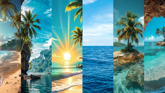
Ocean Background Images in High Resolution — Whether you’re a graphic designer, a blogger, or simply someone looking for a stunning wallpaper, high-resolution ocean background images can add a touch of tranquility and beauty to your projects. In this article, we’ll explore some of the best online resources to find and download free ocean images.

Why Use High-Resolution Ocean Images?

  • Enhanced Visual Appeal: High-resolution images provide greater detail and clarity, making your designs more visually striking.
  • Versatility: These images can be used for a wide range of applications, from websites and presentations to print materials.
  • Professional Look: High-quality images give your projects a polished and professional appearance.

Top Platforms for Free Ocean Background Images

  1. Unsplash: Unsplash is one of the most popular platforms offering high-quality, free images, including a vast collection of ocean-themed images. With thousands of photos from professional and amateur photographers, you can find a variety of ocean scenes, from calm waves to white sandy beaches. Unsplash is known for:
    • Image quality: All images on Unsplash are high resolution, ideal for backgrounds or other creative uses.
    • Community of photographers: Each image is curated by a global community of photographers, ensuring consistent quality.
    • Easy search feature: You can quickly find ocean images by typing relevant keywords.
    • License-free usage: Images can be used for both commercial and non-commercial purposes without attribution, though giving credit to photographers is encouraged.
  2. Pexels: Pexels is another popular platform for free stock photos, offering a range of ocean images with different moods, from calm seas to crashing waves. This platform provides:
    • A diverse collection of images: From peaceful ocean views to stormy seas, Pexels has a wide selection of ocean images.
    • User-friendly interface: The site is easy to navigate, with a quick search feature and a simple download process.
    • High resolution and license-free: All images on Pexels are free to use for personal or commercial projects without requiring credit.
  3. Pixabay: Pixabay is a stock image platform that hosts a vast library, including photos, illustrations, and vectors. Here, you’ll find a dedicated section for nature images, including beautiful ocean photos. Pixabay has several key features, such as:
    • Thousands of high-quality ocean images: Pixabay offers ocean images in various moods and perspectives, perfect for backgrounds or other visual needs.
    • Commercial use without attribution: Pixabay allows images to be used for commercial purposes without requiring attribution, making it a flexible platform for business or personal projects.
    • Multiple format options: In addition to photos, there are ocean-themed illustrations and vectors available for graphic design or creative projects.
  4. Burst by Shopify: Burst by Shopify is a platform supported by Shopify, designed to help small business owners and creators with free, high-quality stock images. Burst also has an impressive collection of ocean images, including:
    • Exclusive image collection: While the collection on Burst may not be as extensive as Unsplash or Pixabay, it offers exclusive, professionally curated images.
    • Commercial use images: All images on Burst are free to use for commercial purposes, making them perfect for business websites or product promotions.
    • Various angles and perspectives: Burst offers ocean images from multiple viewpoints, including close-ups of waves, coastal views, and wide panoramas, making it easy to find images that suit your visual needs.
  5. Gratisography: Gratisography is a top choice if you’re looking for images that are unique and creatively styled. This platform offers a collection of high-resolution, free-to-use images, including some ocean scenes that feature an artistic touch. Key features of Gratisography include:
    • Creative and unique image style: Gratisography is known for its out-of-the-box and artistic images, ideal for projects seeking a different look.
    • Free, high-resolution images: All available images are free of charge and can be used for both personal and commercial purposes.
    • Distinctive image themes: If you’re looking for unconventional ocean images, such as unique angles or unusual colors, Gratisography is a great choice.

Tips for Finding the Perfect Ocean Image

  • Use specific keywords: Instead of just searching for “ocean,” try using more specific terms like “tropical beach,” “stormy sea,” or “underwater coral reef.”
  • Consider the image’s aspect ratio: Ensure the image’s dimensions match your project’s requirements.
  • Check the license: Always verify the license terms to ensure you can use the image for your intended purpose.
  • Pay attention to image quality: Look for images with high resolution and minimal compression artifacts.

Additional Resources

  • StockSnap.io: Another great resource for free stock photos, including a variety of ocean images.
  • Kaboompics: Offers a curated collection of free stock photos with a focus on minimalist and modern aesthetics.
  • Life of Pix: Provides high-quality images free of copyright restrictions.

Conclusion

With so many fantastic resources available, finding the perfect ocean background image is easier than ever. By exploring these platforms and following the tips provided, you can enhance your projects with stunning visuals. Remember to always give credit to the photographer or website when required.

The Ultimate Collection of Professional Logo Design Templates for Designers

The Ultimate Collection of Professional Logo Design Templates for Designers

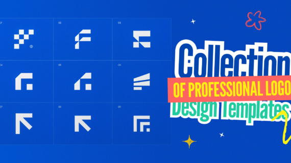
Professional Logo Design Templates for Designers — A logo is more than just a graphic; it’s the visual embodiment of a brand. It’s the first impression a customer has, and it can make or break a business. Designing a logo from scratch can be time-consuming, but with the abundance of professional logo design templates available, the process has become much more streamlined. Let’s explore the world of logo design templates and discover how they can help you create stunning and effective logos.

Why Use Logo Design Templates?

  • Time-saving: Pre-designed templates provide a solid foundation, saving you hours of work.
  • Inspiration: Templates can spark your creativity and help you develop new design ideas.
  • Consistency: Templates ensure that your logo adheres to design best practices and industry standards.
  • Versatility: With a wide range of styles and industries to choose from, you can find a template that suits your specific needs.
  • Affordability: Many logo design templates are available for free or at a very low cost.

Key Features of High-Quality Logo Design Templates

  • Vector graphics: Ensure scalability for various applications, from business cards to billboards.
  • Customization options: Allow you to personalize the template to fit your brand identity.
  • Multiple file formats: Provide files in popular formats like AI, EPS, and PNG.
  • Well-organized layers: Make it easy to edit and customize the design.
  • Clear licensing terms: Ensure you have the rights to use the template commercially.

Where to Find Logo Design Templates

  • Stock photo websites: Platforms like Adobe Stock, Shutterstock, and iStock offer a vast collection of logo templates.
  • Graphic design software: Many design programs, such as Adobe Illustrator and Canva, include pre-designed logo templates.
  • Template marketplaces: Websites like Creative Market and Envato Elements specialize in selling digital assets, including logo templates.
  • Freelance platforms: Platforms like Upwork and Fiverr offer custom logo design services.

Tips for Choosing the Right Logo Design Template

  • Consider your brand: Choose a template that aligns with your brand’s personality, values, and target audience.
  • Pay attention to detail: Look for templates with high-quality graphics and well-organized layers.
  • Check the licensing terms: Ensure you have the rights to use the template for your specific purposes.
  • Customize, don’t just copy: Personalize the template to make it unique to your brand.
  • Seek professional help: If you’re unsure about design, consider hiring a professional graphic designer.

Conclusion

Logo design templates offer a convenient and cost-effective way to create professional logos. By understanding the key features and benefits of templates, you can find the perfect starting point for your next design project. Remember, while templates provide a solid foundation, it’s essential to customize them to reflect your unique brand identity.

Need more inspiration? Explore StocksVector’s vast collection of royalty-free graphics and templates to kickstart your next design project.

Read More:

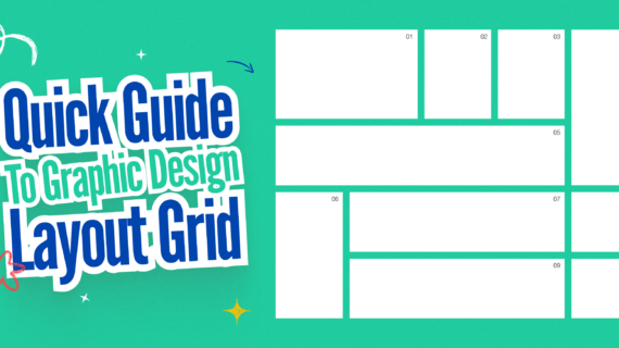
A Quick Guide to Graphic Design Layout Grid Templates for Professional Projects

A Quick Guide to Graphic Design Layout Grid Templates for Professional Projects

Graphic Design Layout Grid Templates — Have you ever wondered how designers create those visually stunning and balanced layouts? The secret lies in the humble grid. A grid system provides a foundational structure that guides the placement of elements on a page, ensuring consistency and harmony. In this article, we’ll explore the world of graphic design layout grid templates and how they can elevate your professional projects.

What is a Grid System?

A grid system is a framework of intersecting horizontal and vertical lines that create a structured layout. It acts as a blueprint for designers, helping them organize elements like images, text, and other design elements in a visually appealing and balanced manner.

Why Use Grid Templates?

  • Consistency: Grids help maintain consistency throughout a design project, ensuring a cohesive look and feel.
  • Organization: By providing a structured framework, grids make it easier to organize and align elements.
  • Balance: Grids help achieve visual balance and harmony within a design.
  • Efficiency: Using pre-designed grid templates can save time and effort.
  • Professionalism: Grids are a hallmark of professional design and can elevate the perceived quality of your work.

Types of Grid Systems

  • Column Grids: The most common type, column grids divide the page into vertical columns, providing a flexible framework for various layouts.
  • Modular Grids: These grids divide the page into a series of equal-sized modules, allowing for more complex and customized layouts.
  • Hierarchical Grids: Hierarchical grids emphasize certain elements by using different-sized modules or columns to create a visual hierarchy.
  • Baseline Grids: These grids focus on aligning text lines, ensuring consistency in typography and readability.

Benefits of Using Grid Templates

  • Versatility: Grid templates can be adapted to suit various design styles and project requirements.
  • Time-saving: Pre-designed templates eliminate the need to create grids from scratch.
  • Consistency: Templates ensure that your designs adhere to a consistent style guide.
  • Professionalism: Using industry-standard grid templates adds a level of sophistication to your work.

Tips for Using Grid Templates Effectively

  • Choose the right grid: Select a grid that aligns with the purpose and style of your project.
  • Understand your design goals: Clearly define what you want to achieve with your design before applying a grid.
  • Don’t be afraid to break the rules: While grids provide a foundation, feel free to experiment and create unique layouts.
  • Consider the medium: The type of grid you use may vary depending on whether you’re designing for print or digital media.

Where to Find Grid Templates

  • Design software: Most design software, such as Adobe InDesign and Sketch, offer built-in grid tools and templates.
  • Online resources: Websites like Canva, Figma, and Adobe Express provide a vast library of free and premium grid templates.
  • Design communities: Join online design communities and forums to find and share grid templates with other designers.

Conclusion

Grid systems are a powerful tool for creating visually appealing and professional designs. By understanding the different types of grids and how to use them effectively, you can elevate your design work to new heights. So, the next time you start a new design project, consider using a grid template to provide a solid foundation for your creativity.

Need more inspiration? Explore StocksVector’s vast collection of design resources and templates to kickstart your next project.

Read More: