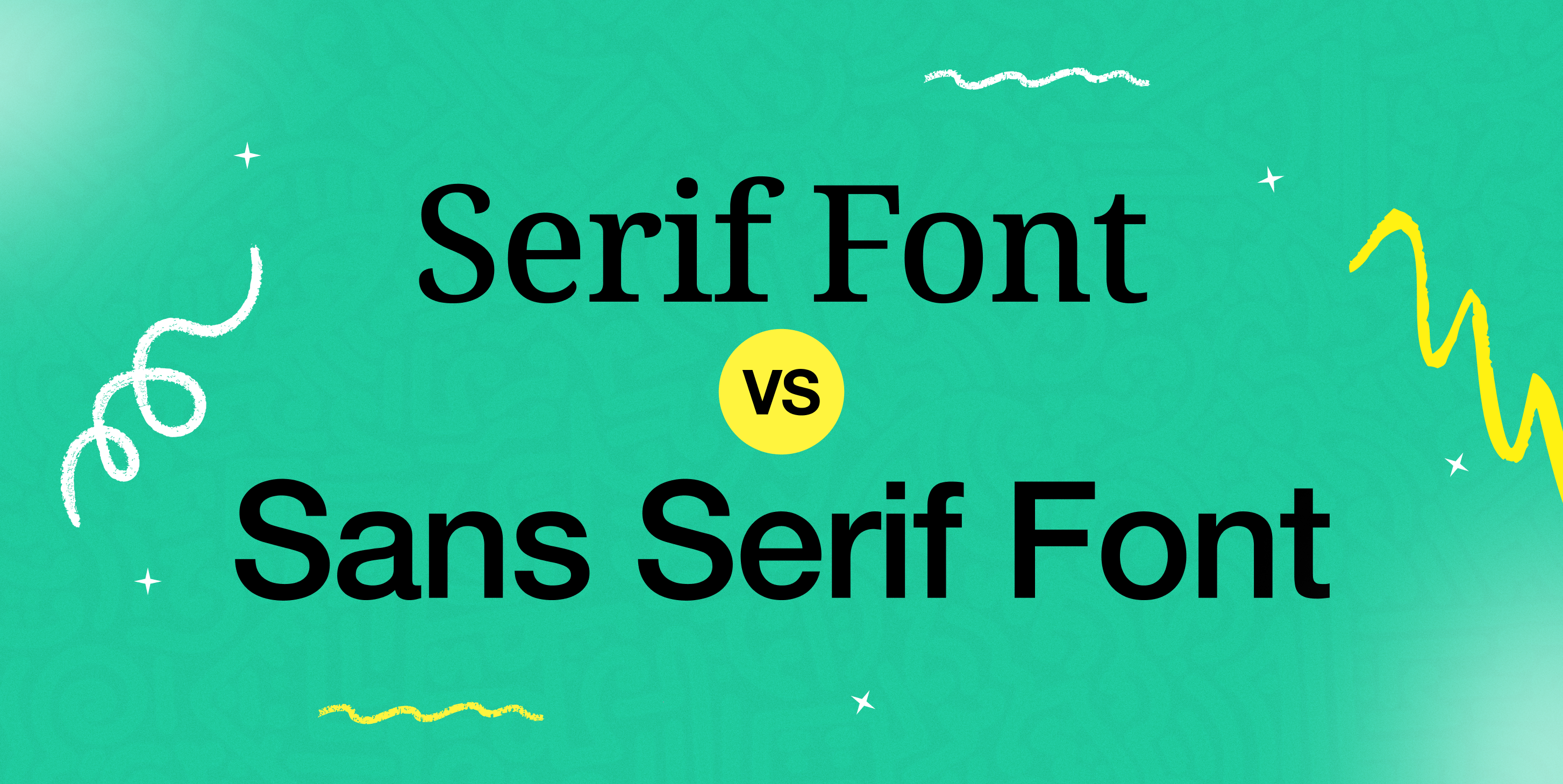
Serif and Sans Serif Fonts — Fonts are powerful tools in design, shaping the look and feel of a brand, conveying messages, and creating unique experiences for readers. One of the most common choices designers face is between serif and sans serif fonts. Knowing the distinctions between these two font types can help you make informed decisions about which is best suited for your design project. Let’s dive into the essential differences and when to use each.
What Are Serif Fonts?
Serif fonts are easily recognized by the small “feet” or strokes that extend from the ends of each letter. These decorative lines, or serifs, give a more traditional, classic appearance. Serif fonts are often associated with reliability and sophistication, making them a popular choice for print media, formal documents, and established brands. Examples of popular serif fonts include Times New Roman, Georgia, and Garamond.
When to Use Serif Fonts:
Serif fonts are ideal for projects where readability and a formal tone are essential. They work well in books, newspapers, and other long-form content, as the serifs help guide the eye along lines of text, reducing reader fatigue. Serif fonts are also commonly used in branding for traditional, elegant, or professional businesses.
What Are Sans Serif Fonts?
Unlike serif fonts, sans serif fonts lack decorative strokes at the ends of each letter. This simplicity gives them a clean, modern, and minimalistic appearance. Sans serif fonts are widely used in digital media due to their readability on screens and are a go-to for tech companies, startups, and modern brands. Examples include Helvetica, Arial, and Calibri.
When to Use Sans Serif Fonts:
Sans serif fonts are perfect for creating a straightforward, contemporary look. They’re highly versatile, making them suitable for anything from websites and mobile apps to logos and social media graphics. Sans serif fonts are especially effective for small screens and digital displays, where clean lines and clarity are crucial.
Key Differences Between Serif and Sans Serif Fonts
- Aesthetic Style
- Serif Fonts give a timeless, classic look.
- Sans Serif Fonts are sleek, modern, and minimalistic.
- Readability
- Serif Fonts improve readability in printed text, guiding the eye along each line.
- Sans Serif Fonts are easy to read on screens, particularly at smaller sizes.
- Associations and Brand Perception
- Serif Fonts convey tradition, reliability, and professionalism.
- Sans Serif Fonts convey simplicity, modernity, and approachability.
- Usage Context
- Serif Fonts are widely used in print materials like books and newspapers.
- Sans Serif Fonts dominate digital media and are commonly used in tech branding.
Choosing the Right Font for Your Project
The choice between serif and sans serif fonts ultimately depends on the message, audience, and medium of your design. Serif fonts might be more fitting for a formal, established brand, while sans serif fonts can communicate a fresh, modern vibe. Many designers even combine both types in a single design to create contrast and interest—for instance, using a serif font for headings and a sans serif font for body text.
Looking for Premium Fonts?
Whether you’re drawn to the elegance of serif fonts or the clarity of sans serif fonts, finding the perfect font can take your design to the next level. For high-quality, premium fonts that elevate your brand’s style, visit Stockvector. Explore a curated selection of fonts that suit every project, ensuring you have the tools to create captivating, polished designs with ease.
Read More:


